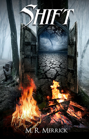
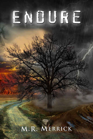
I hope you've enjoyed the peeks into the awesome Protector Series. I know I have!!! This series is among my favourite series and its also among my absolute favourite covers!! They are awesome.


See, stunning aren't they? Anyway, thanks so much to Matthew Merrick who put up with my PMs and was awesome enough to let me feature his books!! I do hope more people will read these and love them :)
Before you go we have an awesome Guest Post from M R Merrick on the covers of the series!
The Protector Covers
The Protector’s covers are a unique set. They each have a different font, and the only common physical factor in them is the magical elements. When I set out to design them, the only thing I knew for certain was that I wanted the elements involved. I didn’t have a clue what else I’d include. I had reached out to an Australian cover designer for Exiled. She had come highly recommended to me so I gave her two different ideas and we were off to the races.
When I got the first two mock-up’s back, I was blown away. In all honesty, I thought I knew exactly what I wanted. The only reason I’d even given a second option was simply to say I had given myself a choice. I wanted the fire and water elements to be opposing, and the first cover was beautiful. It was everything I had hoped it would be. The second cover however was…powerful. That’s the only way I can explain it. I didn’t know what it was, but something about it pulled me in. It was a simple mock-up with a tree in the center of a field and the fire and water rising on both sides. I hadn’t expected to like it, and here I was enthralled with it. I tossed and turned trying to figure out what to do. Do I go with what I knew I wanted from the beginning? After all, it had blown me away when I finally saw it. Or do I opt for the new image that called to me in an entirely different way? I followed my gut and after a few changes to the tree, I opted for the second one. It told me too much about the story in a completely unexpected way, and the cover to Exiled was born.
After that, each cover fell into place as the story came to life. The one thing I wanted to keep constant were the elements, and I wanted each cover to mean something different. When you first look at them, you can see a lot of different features involved, and not just the magical kind. Each cover stands on its own and has a different feel. After you read the story however, the cover means something entirely different. It clicks into place and makes sense in a different way. It’s even more beautiful than before. Those books each tell a part of the story, and I thought the covers should too.
I’d be lying if I said I never doubted them though. I’ve considered changing them multiple times. The last few months I’ve spent a lot of hours going back and forth. Would a cover revamp draw in new readers and be more mainstream? Could they help bring in readers that weren’t captured by the current covers? Would it help sales and entice more people to try out a new-to-them author? To be honest I haven’t even decided, but I do find it difficult to think about putting those covers away and wrapping the story in something new. New would streamline the series and make each cover connect to the other while still being able to tell a different story, but it wouldn’t be these covers. It’s not that I’m opposed to change, but these covers hold so much of the story in them, how could I let them go? For now I remain undecided, but my love for the covers hasn’t wavered at all. They’re symbolic to me of a journey born completely by accident. They changed my life, and even if the covers were to be revamped, these original ones would always exist in my heart as the true face of The Protector series.
Let me know your thoughts about the books and covers and dont forget to enter to win and thanks for stopping by!
a Rafflecopter giveaway

i do think the covers are special ( in a good way) but it also true that they deterred me at first... i was afraid teh series would be too dark when i saw the cover ( but i was rassured by some bloggers that loved the books/series)
ReplyDeletei'm really happy to discover now how they came to be
i also really appreciated your event Natalie i planned to check each post daily but we had trouble with internet so i got behind my schedule but really i loved each of them and i'm sure you made more people want to try teh series so a big thank you
Thanks Miki, its good to hear you enjoyed this!! I agree that the covers are dark but I'm drawn to covers like that :) I really enjoyed Matts post about the covers too!! Thanks for stopping by :)
ReplyDeletei wanted to let yuou know it^^ i think it sad no one dared to comment so i will try to spread the word a little now that i have internet back ( and i'm so glad it's a complete serie in 4 books^^ i have hope to get them all before years^^;;)
Delete